So how was it?! Was Christmas 2012 everything you had hoped it would be? We had a great one and really enjoyed making new traditions – This WAS our first year as a married duo, after all. There are still some kinks we need to work out in terms of where to go and when (both of our families live in town, so we tried our best to split our time evenly), but it was fun to have double the celebration. Oh, and in case you missed it over on Instagram and/or Twitter, my family knows alllllllllll about my Kate Spade obsession…Still can’t believe that this special little collection of goodies is mine all mine.


And yes…We have pets. Black furred minions who rub all over everything, hence the dark lines all over that hastily shot photo above. Gotta love ’em!
So what did you guys get? Not to verge on cheesy here, but I hope that in the midst of all the gift giving and receiving, you had a chance to consider those a little less fortunate…We are currently stockpiling towels and pet food to donate to the animal shelter this weekend in order to give back a little of the amazing love WE were given this holiday season.
But, alas, the aforementioned season is winding down and we must return to everyday household stories. In fact, I’ve got a little one for you today as we get back to a state of normalcy.

Yup. It’s time to get my paint on. One. More. Time.
I gave my green bathroom a good long time, 11 months to be exact, but it just never fully jived. I think it looks great – It’s perky and energizing, but it’s just not a fitting color for our largely gray/yellow/mint home. That color scheme said though, I wasn’t ready to fall into old habits ENTIRELY. Instead, I thought I’d opt for a more neutral color, but still a slight departure from the norm. I’m thinking pink…

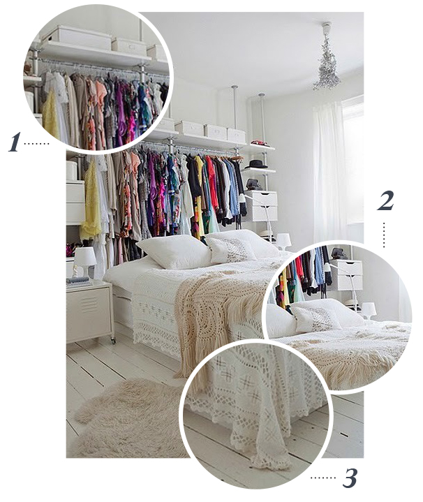
It is infuriatingly hard to see the “pink” in these two samples I painted up on the wall, but trust me, they’re pink. It all started when I saw this bedroom online, care of Crystal Gentilello of Rue Magazine. Her space is painted in this gorgeous mauve blush pink that is just neutral enough to feel soft, but pink enough to be a bit bold too. I love the balance and thought it was a great option for our master bathroom, which has turned out to be my own personal domain thanks to John taking over the studio bathroom. Every girl needs a feminine oasis in her life, am I right?
Now, my space isn’t even close to that styled yet, and my photos again don’t do the potential color options justice, but I’ve got a plan in the works.
P.S. Although the samples look almost entirely gray (especially in comparison to my inspiration image) I’m definitely leaning towards the one on the left closest to the window. It’s a good bit darker than the one on the right and helps make the white trim pop. The iPhone snapshot below may actually be the best representation of the color.
In any case, here’s to keeping you guys posted on the project in the new year – When I get around to it, that is!